Case Studies: Womply Offers, a SaaS Product
Overview
Womply’s SaaS product for small businesses historically offered financial and online reputation management features. However, starting in late 2017, email marketing features (starting with automatic emails for transactions, birthdays, requests for online reviews, holidays, and more) became a focus for growth of the product and company.
Below is a case study of the Offers project, interspersed with some of the slides from a presentation about Offers that I gave to the entire product side of Womply.
Why
Womply’s email marketing features focuses on engaging small business’ existing customers, with the goal of having them be repeat customers.
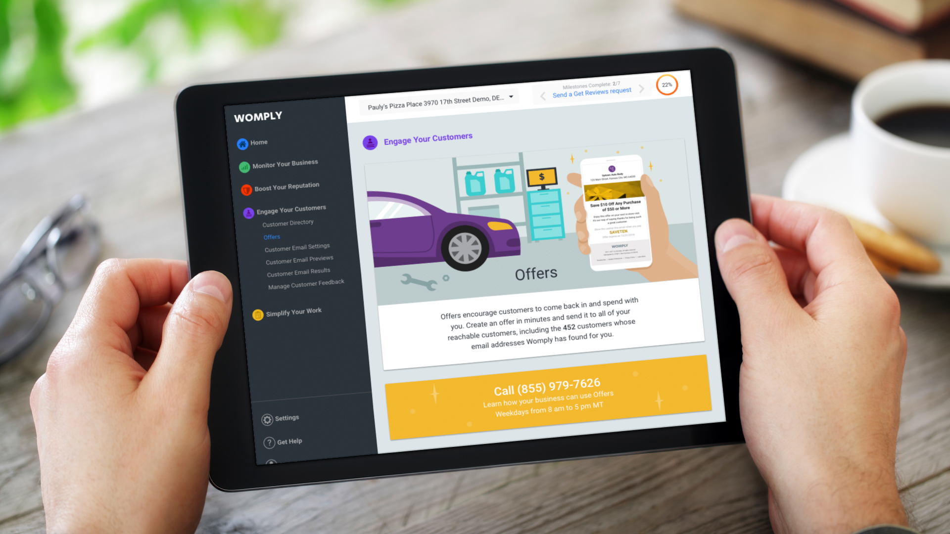
Offering a discount is a way to further entice a customer to come back in and spend with the small business, so it wasn’t a surprise that small business owners were frequently expressing to our sales and customer success teams that they’d love to be able to easily email special discounts to their customers as well.
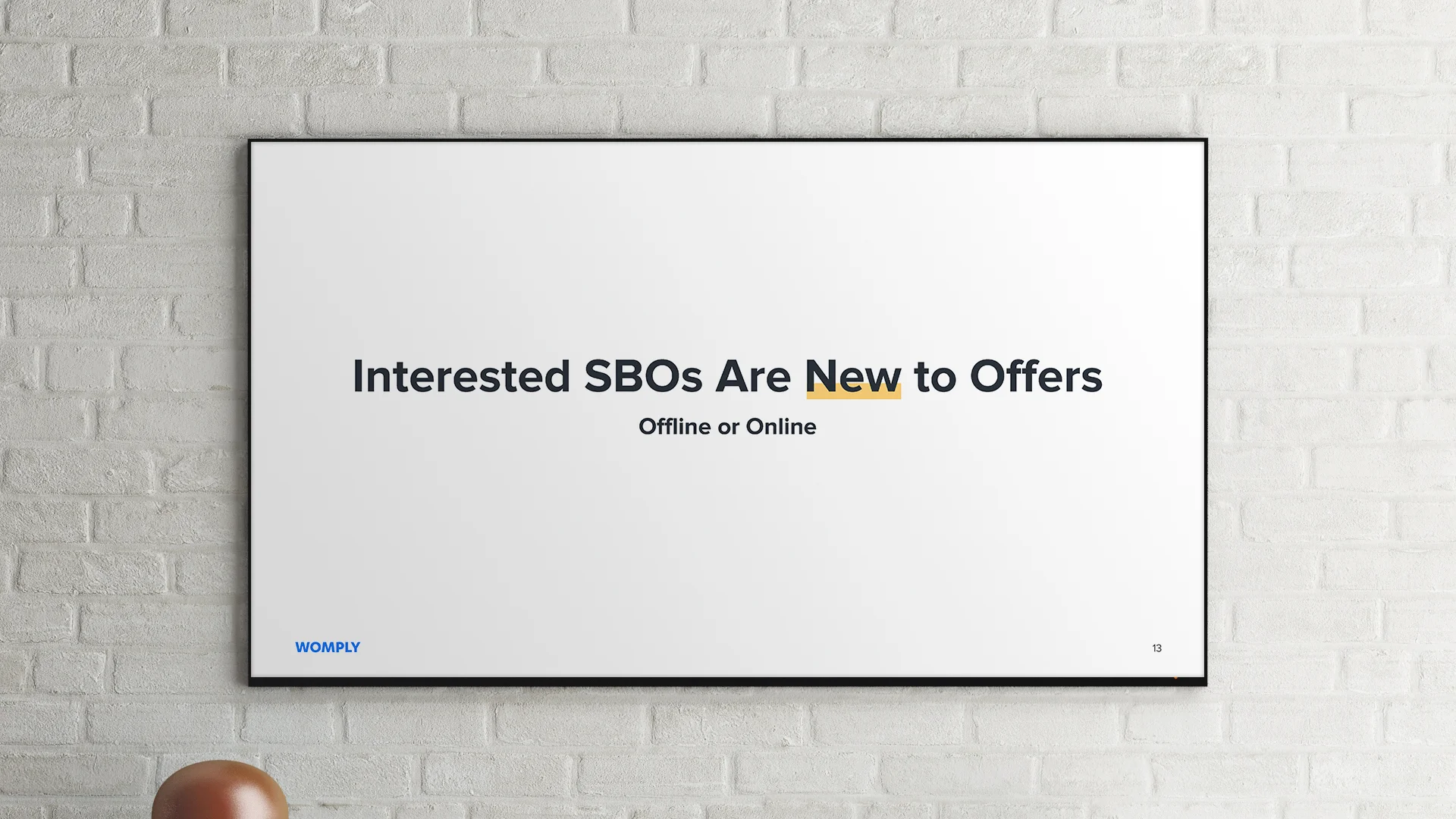
Most of the Small Business Owners Requesting This Feature Had Never Previously Offered Discounts to Their Customers at All
When we investigated further into this area of interest, we found that most of the small business owners requesting this feature had never previously offered discounts to their customers at all (whether via email or direct mail).
This key fact informed many of our design choices as we created Offers. It liberated us from having to implement certain quirks or features from other products that small business owners may be used to or expect, but it also meant that we needed to minimize friction and cognitive load throughout each step of the process a small business owner would take from creation to execution.

Research
Before diving into sketching any prototypes, we analyzed the main competitors for Offers, which included Square, Facebook, and Yelp. It was fascinating to discover that even just looking at three companies, we found vastly different takes on what an offers product for businesses should be.
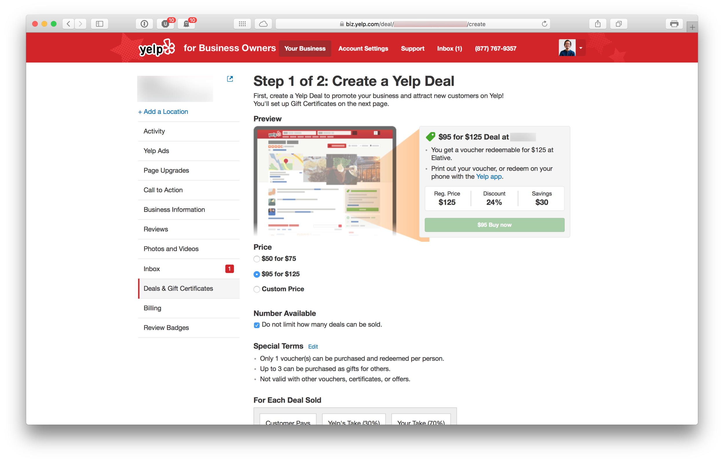
Yelp
The most streamlined expression belonged to Yelp. Their entire Deal feature is represented by a single form consisting of questions that have predefined answers by way of multiple choice or checkbox UI elements.
This approach certainly allows for minimal friction, but in our testing, we found it to be too restricting for small business owners who wanted to be able to experiment with different ways of enticing their existing customers to come back.

Square
On the other end of the spectrum is Square, with customization features so advanced they give Squarespace a run for its money. While it can be fun going wild with Square’s tools for creating an email marketing campaign that includes a discount offer, there are a few issues we identified as ones we needed to avoid.
When we researched actual offer email campaigns from small businesses sent from Square’s platform, we noticed that the advanced creation tools gave small businesses too much design power; awkward layouts and rambling copy all served to dampen the impact of offer emails.
Advanced Creation Tools Gave Small Businesses Too Much Design Power; Awkward Layouts and Rambling Copy All Served to Dampen the Impact of Offer Emails
And that’s just the design tools, which is only one step out of four standing in the way of a small business before they can actually reach their customers! All of these issues that stem from the feature-rich nature of this mature product served as a relief to us, as there was no way even half these customization features would make it into an initial agile release anyway!

Facebook utilizes a two-pane layout that has a form to fill out on the left and a preview on the right. And while the Ads Manager platform is more like a deepwater enterprise solution than it is a product for the average small business owner, the offers feature is an efficient balance of features and streamlined workflow.

Focus
Since Offers was to be a completely new section of the product, and interested small business owners were inexperienced with sending their customers discounts, we put a priority on creating a focused MVP, one that would be immediately easy to understand and use. This meant we needed to be very intentional with every feature and UI state, so as to remove any potential friction or burden on the small business owner.
We Needed to Be Very Intentional with Every Feature and UI State, so as to Remove Any Potential Friction or Burden on the Small Business Owner
In two core design sprints and two core engineering sprints, we optimized for a simple offer creation flow that allowed for small business owners to easily experiment with defining an offer and emailing all of their existing customers in mere minutes.
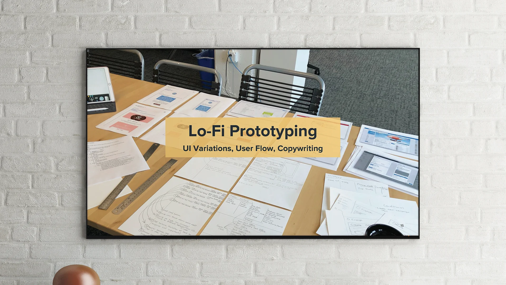
Prototyping
In an effort to quickly iterate within our two-week agile sprint cycles, I sketched out all concepts, wireframes, and other sketches exclusively using pencil and paper. This allowed me to work quickly within our existing agile sprint cycles and discuss (with frequency) not just ideas, but actual drawn out concepts and prototypes with the product manager and the engineering manager.

I used the various main ideas and approaches of the three competitors we reviewed earlier in this project as a starting point for initial rough concepts. As I presented ideas and discussed them with the product manager and engineering manager on the team, we started to get a sense for what would work best for our specific needs, not just for our small business owners, but also our business goals and logistics (such as timeline requirements for our financial roadmap).

Initially, the product manager suggested we consider fleshing out blast and drip campaign features for the initial release. As I sketched out prototypes, it became clear that a significant amount of UX iteration and testing would need to be done to ensure that the Offers product wouldn’t be confusing and daunting to use. And even then, a certain amount of friction would be unavoidable.
So as we reviewed various initial prototypes, I kept in mind that the small business owners most interested in this new Offers product are inexperienced. As a result, I gradually focused in on the idea of a clear blast campaign feature with a very streamlined user workflow, one where the Create an Offer experience is the core of the Offers product.

To ensure that the UX goal of designing a simple and clear product for inexperienced small business owners would be realized, I carefully considered all details, including the tone and consistency of all the terminology (and copy overall) to be used throughout the product and in explaining the features.

Tables of customer, financial, and other data are implemented throughout the overall Womply SaaS product, so I used this opportunity to find a balance between maintaining consistency and also refining some aspects of our data table organization and design.

UI
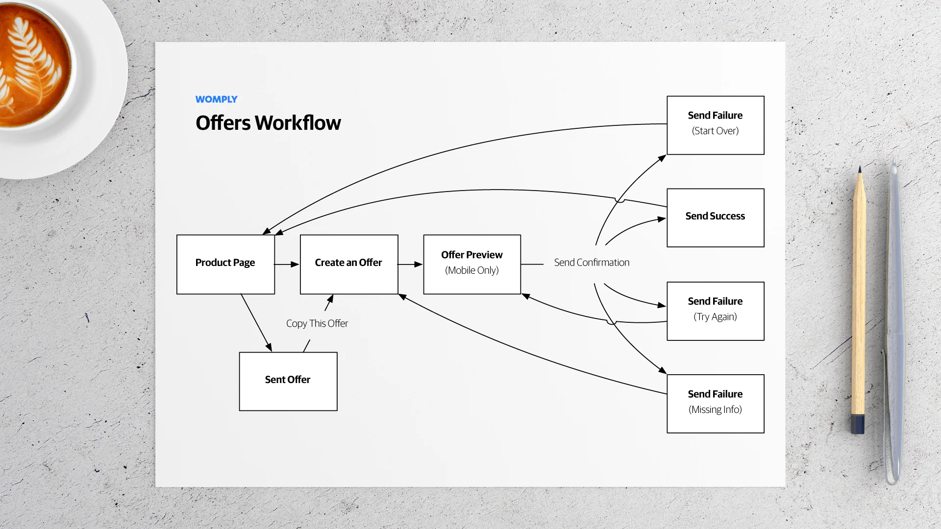
With each distinct component and feature, I worked closely with David, a front-end engineer on the Offers team, to explore various scenarios and edge cases, as well as strike a balance between good user experiences and technical difficulty.
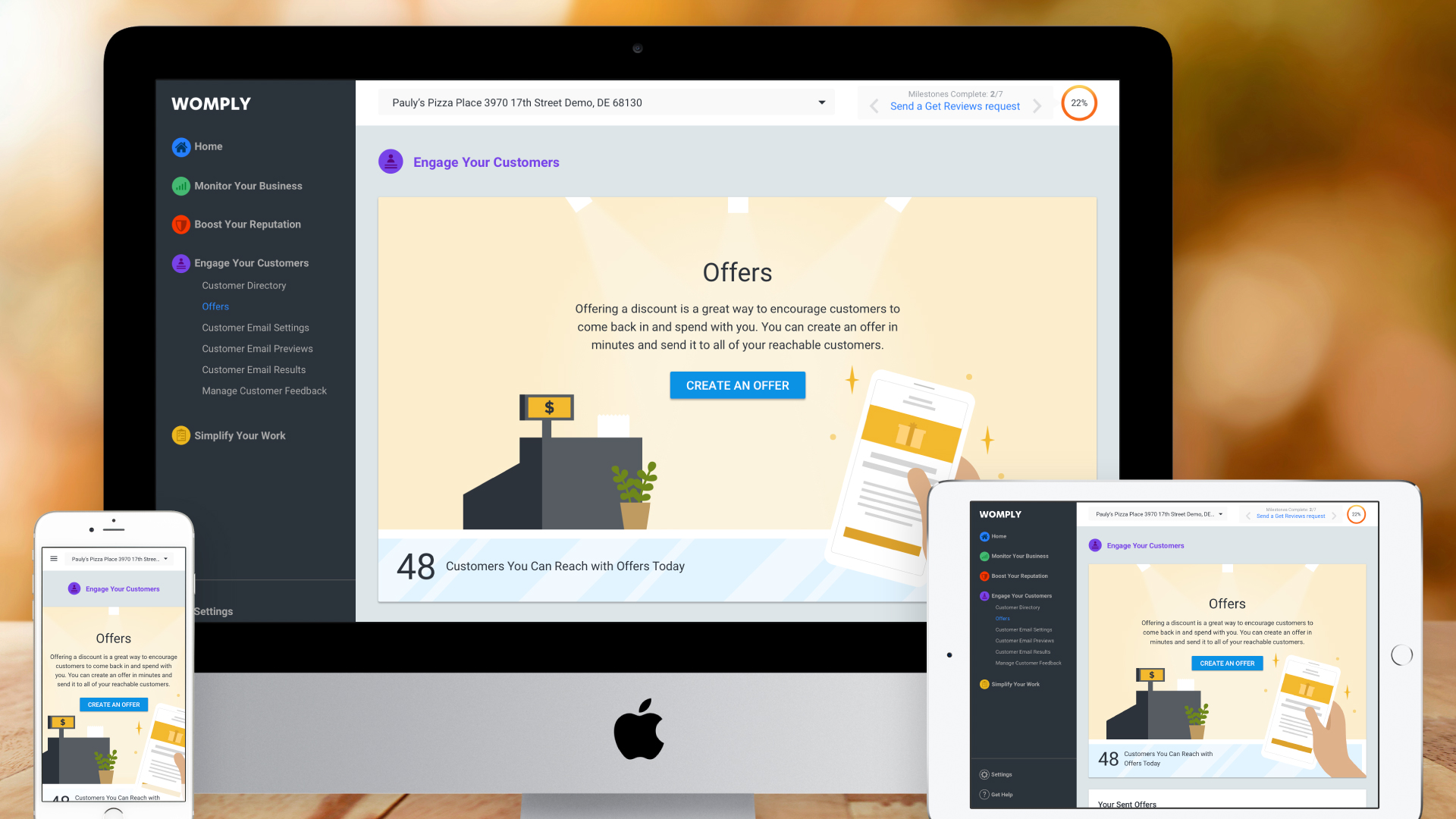
This included everything from the intricacies of how the two-pane Create an Offer modal would scale responsively to become a two-step flow on mobile screens, to implementing a confirmation step for sending offers, to displaying success and various failure dialogs, and much more.

A two-pane layout, rather than a WYSIWYG single, simultaneous edit and preview approach, frees the edit section to visually surface useful information, such as the formatting of fields, character counts/limits, and more. It also then allows the preview to be exactly that, without any additional buttons or annotations that only the small business owner sees during the creation of an offer.
All of these factors were reasons why we found that the learning curve of the two-pane layout was easier for our small business owners, and as you’ll see later in the process, became the basis for our offer creation experience.
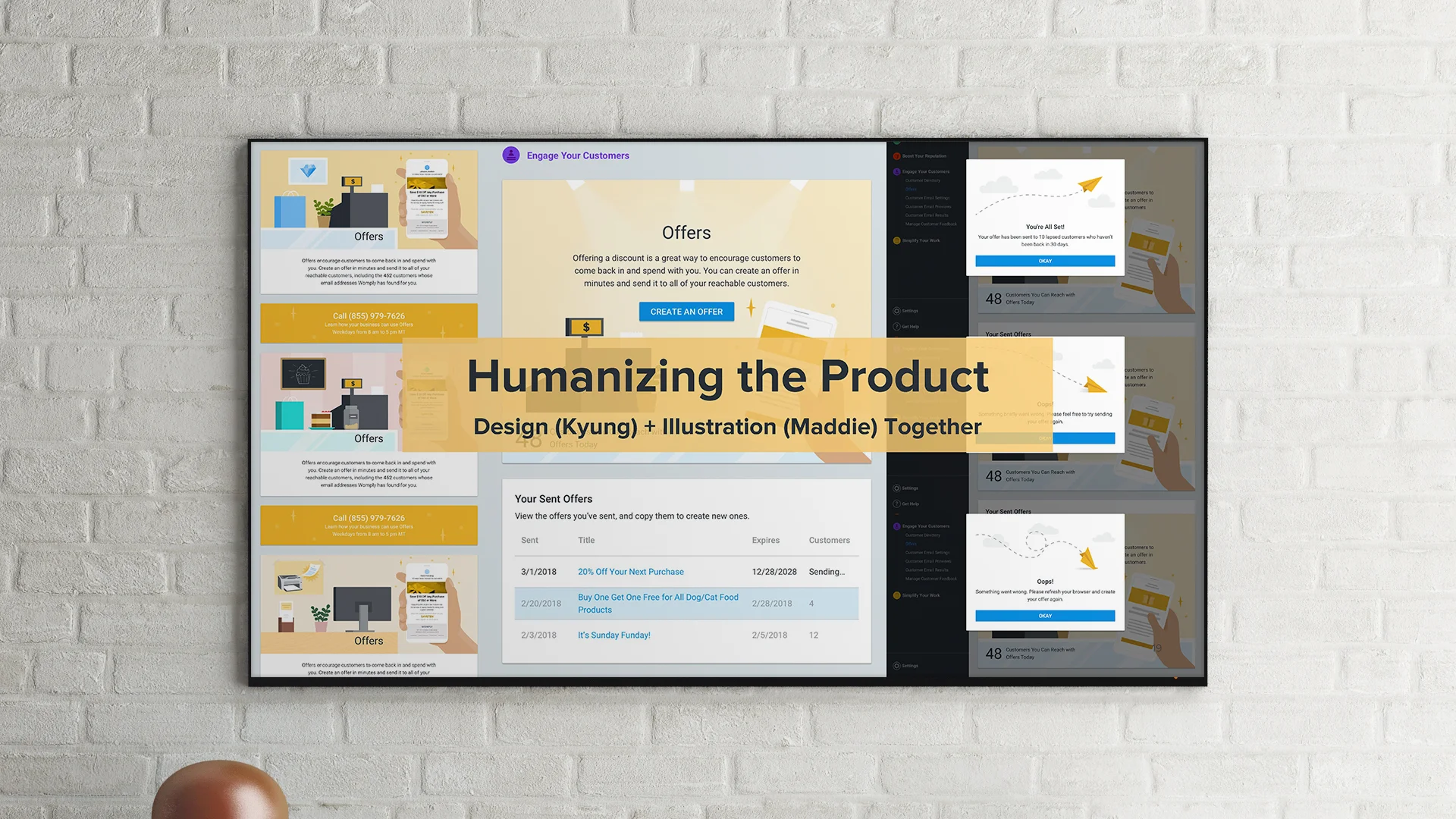
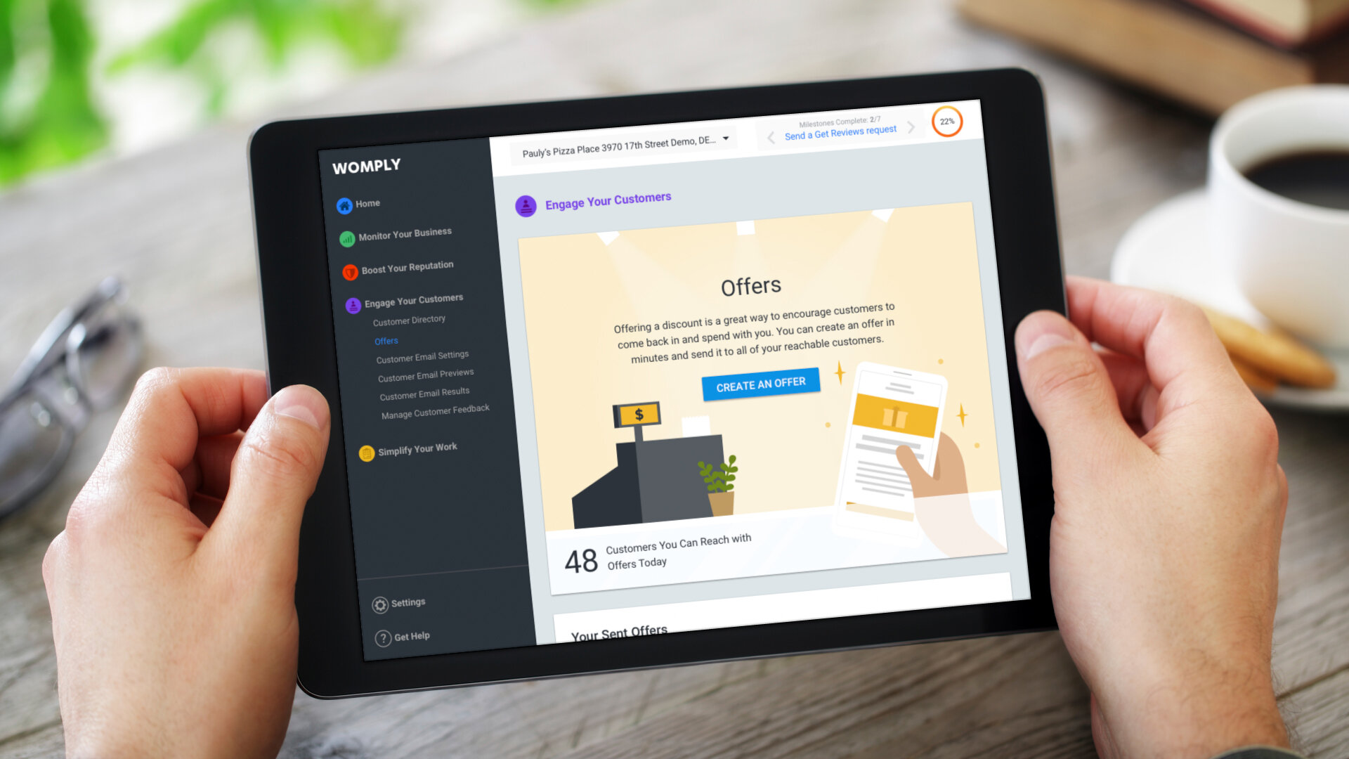
Illustration
For the first time at Womply, we incorporated rich illustrative elements into the product by way of the Offers UI, further allowing small business owners to easily envision how Offers could help both their customers and their business. I worked closely with Madeleine, our Junior Visual Designer, to define an illustration language for the product.

Much of the product today uses the stock defaults of Material Design. This includes cards with big blue title bars and other uninspired ways of organizing and displaying content.
To ease the rest of the company along with this kind of upleveling of the product design, the product manager and I planned to iteratively design and launch bolder design elements over the course of multiple sprints, eventually ending up with the final edge-to-edge illustrative designs that I codenamed “Rainbows & Unicorns” during the project.
Launch
This was the first time user research, competitive research, and various UX processes were implemented during the creation of a new feature at Womply. It resulted in a product that was focused on addressing the pain points of small business owners in a focused and deliberate way. And it allowed everyone involved at Womply, from engineering, to product management, to product marketing to easily understand their role in launching the product.
In Less Than a Week of Offers Launching, a Small Business Owner Saw the Upsell Page and Proactively Called Us to Upgrade
And for the first time, small business owners are able to understand a new feature to our product and the value it adds to their business all on their own. The sales strategy for our product and all upsells involve our sales team proactively reaching out to small business owners. However, in less than a week of Offers launching, a small business owner saw the upsell page and proactively called us to upgrade and enable Offers for their account.