Case Studies: Stanford Jazz Workshop, a Registration Web App
Overview
Stanford Jazz Workshop (SJW) is a non-profit organization dedicated to jazz education and appreciation. They hold annual summer camps for all ages and skill levels, as well as a summer festival that attracts some of the best in jazz.
Challenge
We worked with SJW annually for almost half a decade, refreshing their branding and performing seasonal marketing and advertising campaigns. In addition to that, we also tackled a large foundational project for them each year. Previously, we replaced their static website with a robust ExpressionEngine-powered dynamic website, and in 2013, it was time to bring their workshop registration process fully online.
Research
The staff at SJW responsible for creating and defining the programs were the same ones who’d spend countless hours on the phone assisting parents and young students on choosing the right programs for them, as well as tracking down missing contact, medical, and payment info. And transferring all the data from employees’ computers to the company Filemaker database was a manual process as well.
While all this personalized attention for almost every student was on one level incredibly commendable and undoubtedly appreciated by their customers (though all the time spent wrestling with Filemaker and keeping data manually synced across devices was a more thankless job), it put a significant drain on their already limited resources. The goal was to not only implement the entire registration process online (synced with their Filemaker database), but also to display everything in a much clearer manner, so that additional customer support needs could be minimized.
We Needed to Internalize all the Information, as if We Created the Programs Ourselves
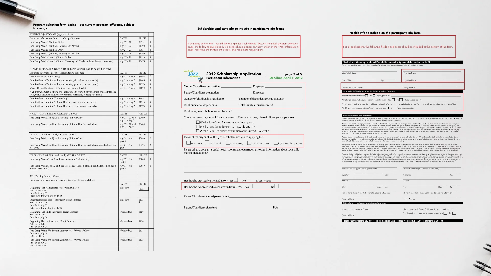
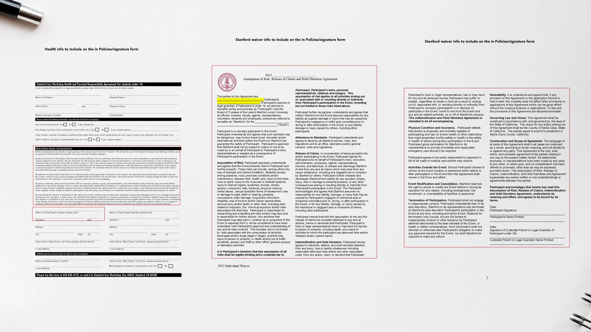
We started by reading, learning, and absorbing all the intricacies that were lovingly detailed by SJW in paper application forms, various spreadsheets, and other internal documentation. We also spent hours in conversation with them to gain further clarification, just as (well, in our case, more so than) any of their customers would.
We also worked with SJW and their IT consultants to identify all the pain points they run into as they manually try to keep all the information synced from employee computers to the company Filemaker database.
Our engineering team then worked with their IT consultants to configure an API for the new registration web app to automatically sync completed registrations to SJW’s Filemaker databse.
UX
From our research with SJW and their customers, we were able to identify a few key issues to keep in mind. There are lots of programs happening on different weeks for specific age and skill levels. Several of the programs overlap in the schedule at various points. Some of the programs include housing options, meal plans, and other custom configurations. Scholarships could be awarded based on merit or financial aid.
There Was a Seemingly Endless Stream of If/Then Rules and Variable Costs, and the Key Was to Not Let the User Drown in Them, or Even Feel Like They Could Drown in Them
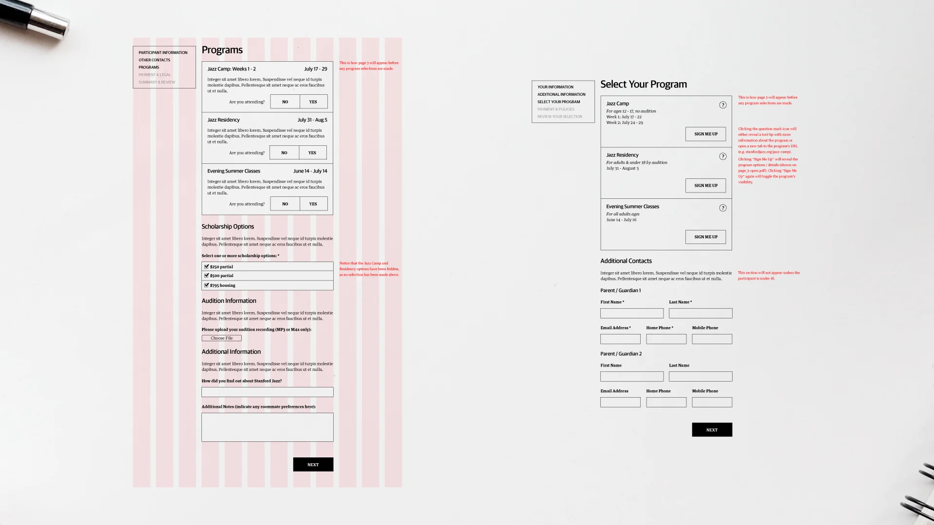
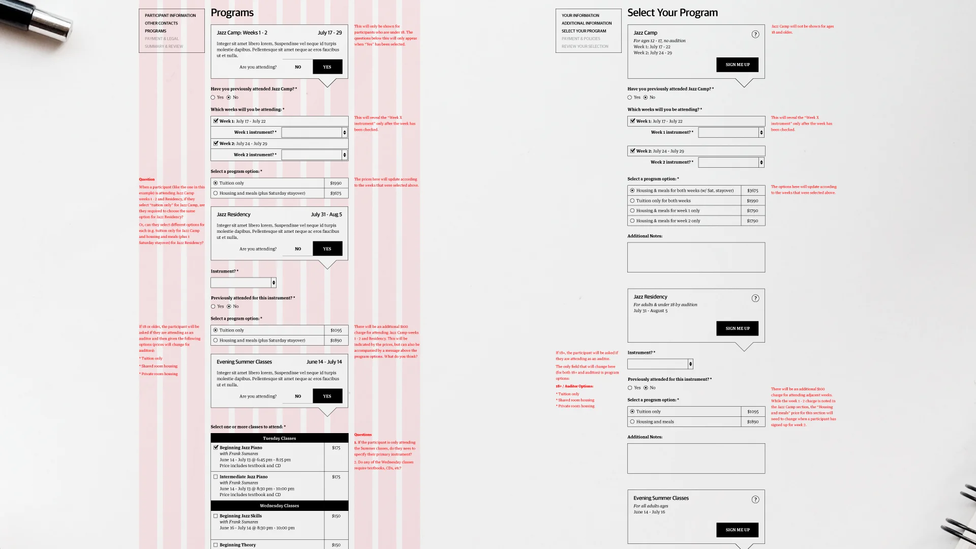
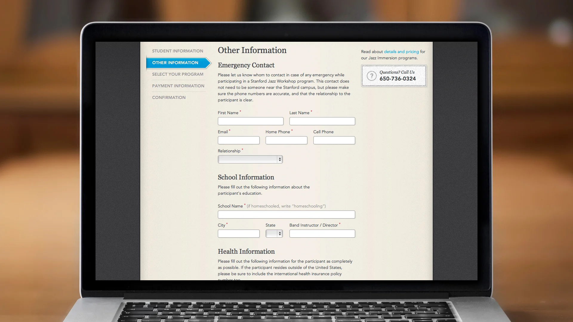
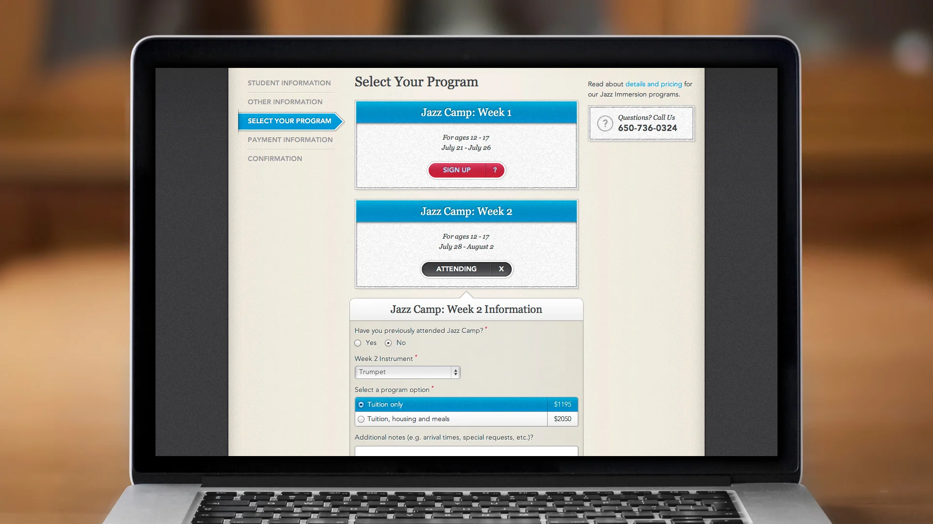
We focused our UX efforts on the programs specifically, as the UI would need to only show a limited number of details and options at first, then based on user selection, carefully guide the user to customizing their program enrollments to their needs.
At the same time, we couldn’t cause user exhaustion by created a form that had 30 steps to it, even if each step was a simple yes or no question (how many of us just quit on surveys that over-estimate our patience?). Groggy-eyed parents need to be able to fill this out after putting the kids to bed, and while we didn’t want them feeling overwhelmed with dense information, we also had to ensure they always knew how far along in a seemingly (to them, at least) concise process they were.
So we tested out a range of options to find just the right balance of having each step be simple enough and having the least number of steps as possible.
So, once users choose just the right program(s) and options for them, are we done? Hardly! Another issue we discovered during research was that often people would forget the exact configurations they chose, and what the total amount of money they owe is.
Conversations about Money and Finding Out at Camp that You Need Meals but Didn't Sign Up for Them, These Were Unpleasant Surprises that Happened Too Often
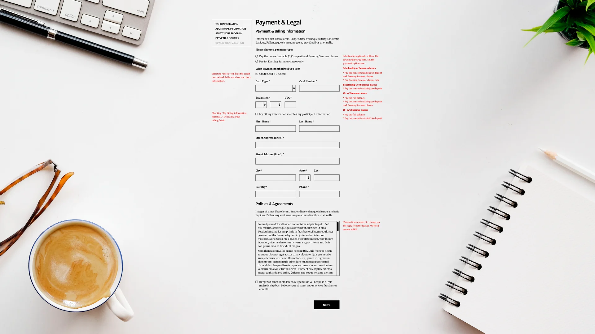
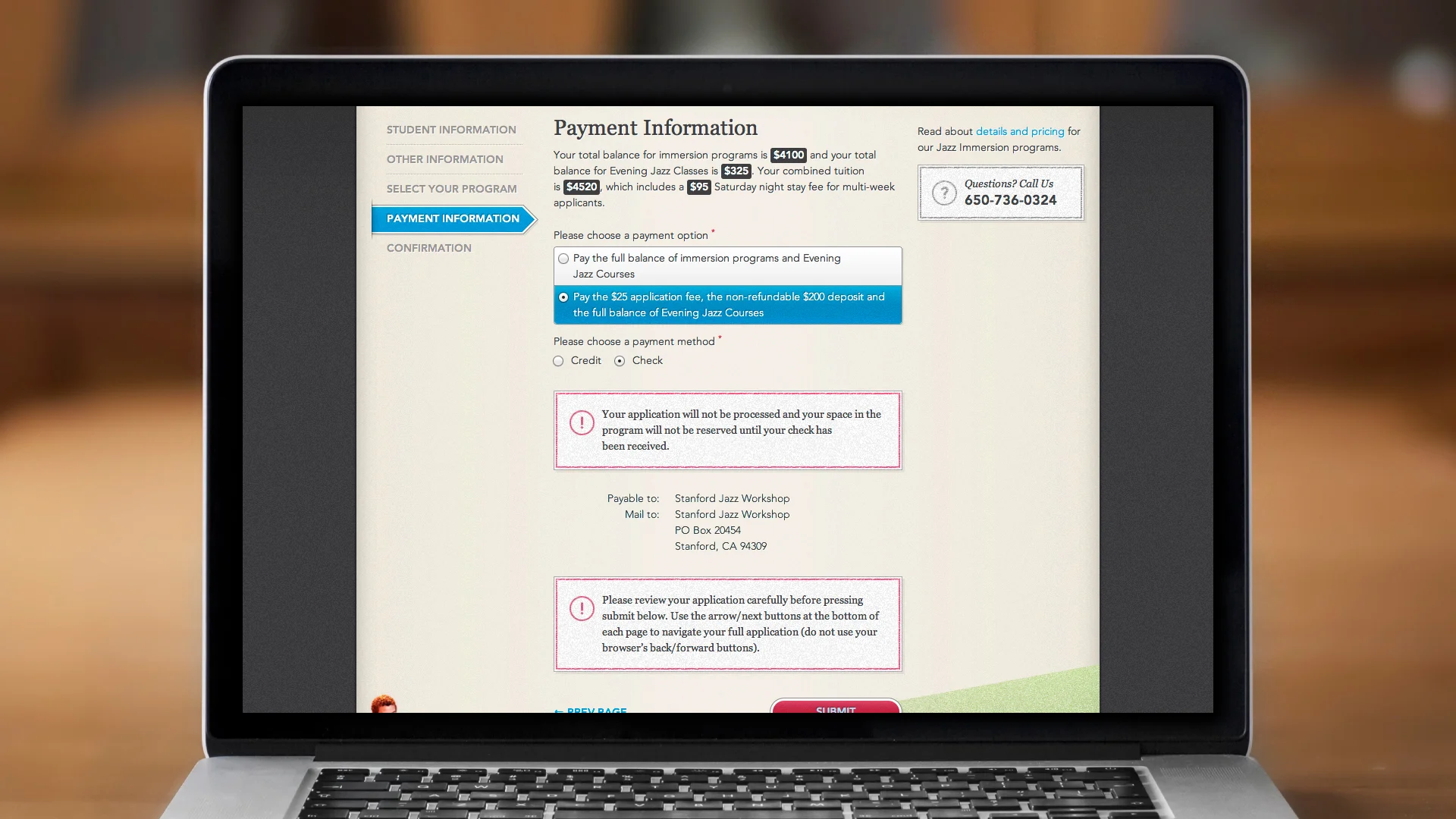
The web app needed to make clear how much they owe, and what the breakdown of the costs are. As you can see in the final design for the payment page, there’s clear messaging that not only gives you your total amount due, but a high-level breakdown of those costs. And while we tested wireframes and prototypes that would have a full summary of all the form data a user selected and filled out, too often users would think they were done on that review page, so we instead had the web app email a summary of all enrollments and options.
Design
The heavy focus on trying to present complex information as clearly as possible wasn’t just for the UX phase. Even though all parties involved were feeling pretty good about the resulting wireframes, the user base for this web app would be busy, stressed out parents (who weren’t necessarily tech saavy) and middle to high school students.
The Design Needed to Augment the Clean Usability Established in the Wireframes
During the course of the previous year’s web refresh, we established an extensive collection of UI elements that were an extension of the SJW brand design language. We incorporated them (as well as some newer UI elements) into several prototypes.
After several cycles of testing and iterating on the design, we ended up with a registration web app that dramatically cut down on SJW’s customer support and brought them a record number of enrollments to their summer workshops.
Quote
“My organization needed a brand makeover and web technology upgrade with some marketing oomph… Kyung Min and the team at Elative were recommended to me by an associate with extremely high standards at a large high-tech company.”
“I’ll cut to the chase: Record sales have ensued, even in a down economy and in a market that’s not without significant competition. Feedback from longtime customers and business associates is uniformly high in praise.”
“…their work has enabled me to eliminate one of the worst time- and money-sinks that our organization faced: a rabbit-warren of a web site that had as many problems as it had different designers working on it. …The Elative folks are good, and they’re good folks.”
Ernie Rideout, Director of Marketing for Stanford Jazz Workshop


